Concept
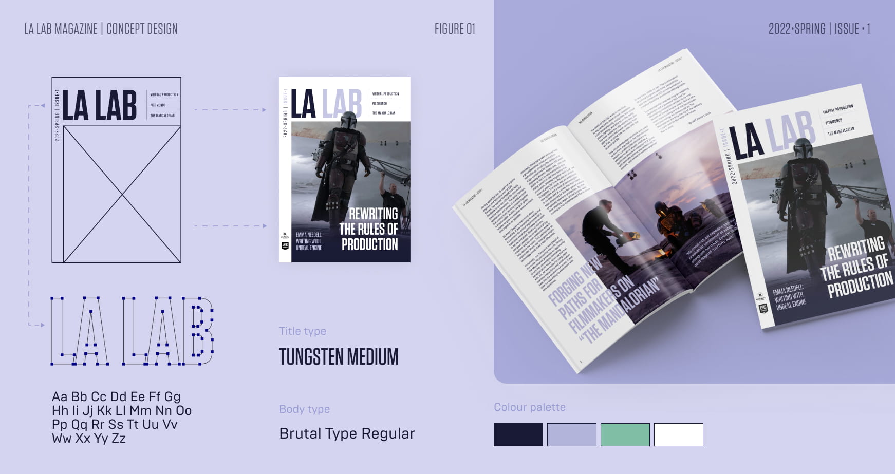
I began by designing the magazine’s title using Unreal Engine’s brand fonts, establishing a strong visual identity from the get go. The rest of the cover got developed incorporating a distinctive detail where an image breaks out of the frame, adding depth and visual interest.
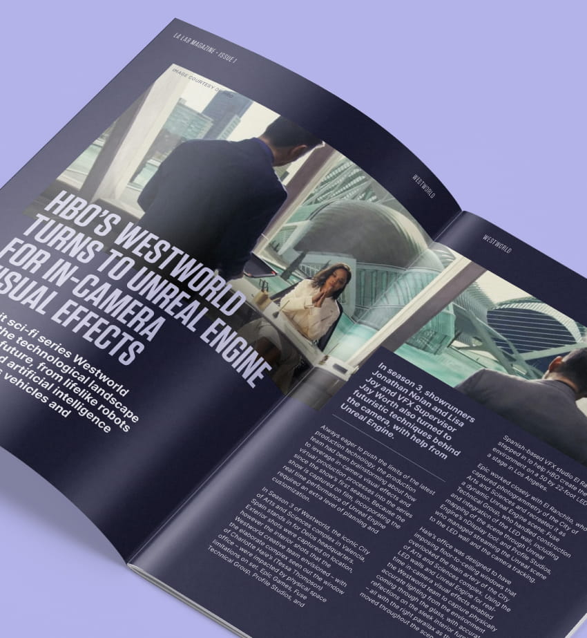
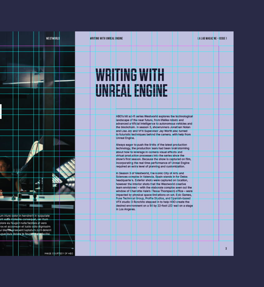
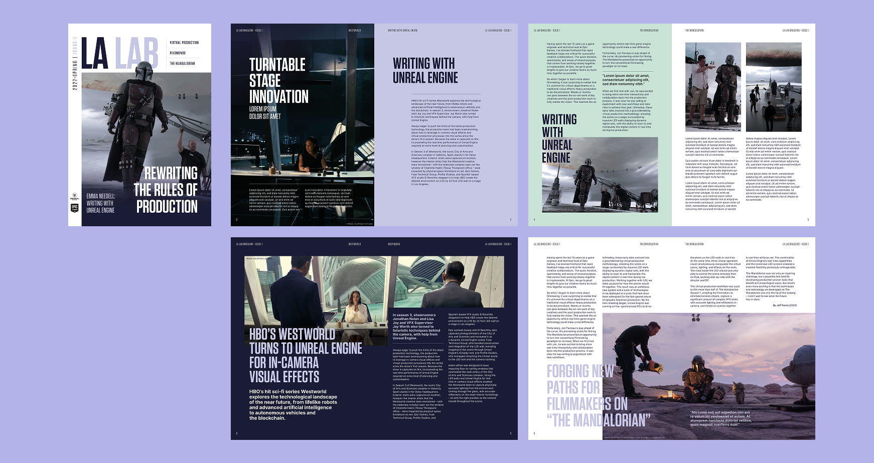
Throughout the magazine, the interior pages echo this approach by using a blocky layout as images interact with titles and coloured sections. These elements create a cohesive and dynamic visual rhythm in the grid system, ensuring consistency across the entire publication.
Designed while working at
Paper Dog.